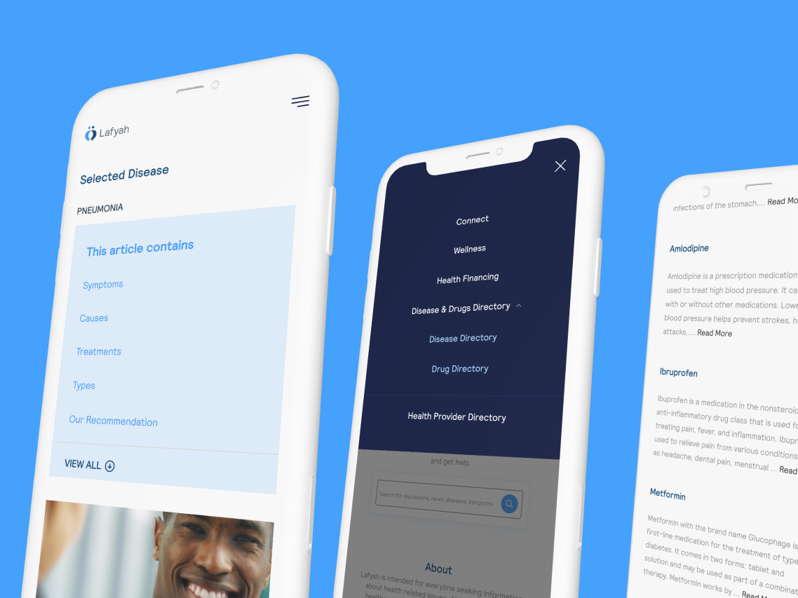
Online Health Community Website
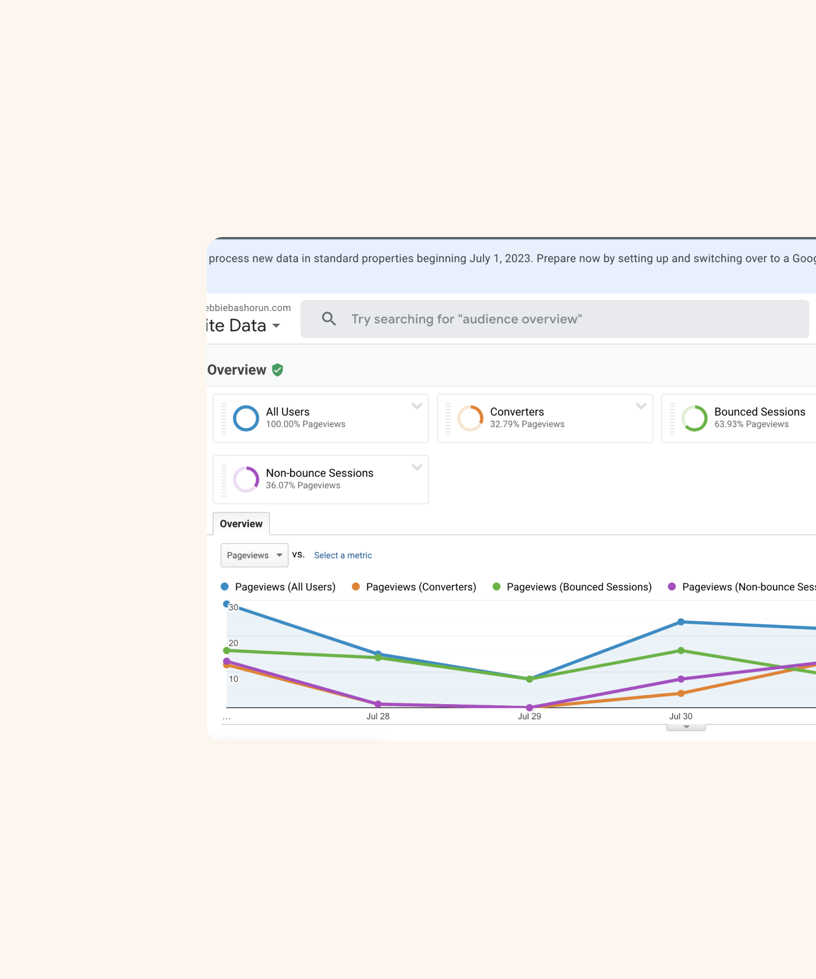
I helped this NGO design a website that had 38.4% returning visits within 6 months of 'go-live'.

Client
Pharma Access
My Role
Product Designer
Tools
Figma, Skype, Papers, Cameras
What I did
- Questionnaire
- Focus group
- Usability testing
- Information Architecture
- Wireframing
- UI Design
- Prototyping
Duration
24 weeks
Impacts
in the past 6 months
93.2%
New visits
38.4%
Returning visits
Project Brief
“Online health community participation leads to direct benefits in the form of information utility and social support and that information utility also helps to shape perceptions of patient empowerment among community participants.” – Online health communities, An assessment of the influence of participation on patient empowerment outcomes, Johnstone, Worrell, Di Gangi & Wasko, Information Technology & People (May 2013).
The above is why I was super excited to take on this Project as a Freelance UI/UX Designer and this Case study chronicles the design processes involved in this Design project.
Problem Statements
In Nigeria, there is no Centralized Health Information platform where healthy or recovering individuals can visit to learn about their health and new symptoms and get help till they are whole and/or maintain that health.
- About 49% of people do not check in with their Doctor/Health Worker regularly (Quarterly, Yearly, or when they are sick, as opposed to Monthly or Weekly) – Our Offline Survey.
- Noncommunicable diseases, such as diabetes, cancer, and heart disease, are collectively responsible for over 70% of all deaths worldwide, or 41 million people. This includes 15 million people dying prematurely, aged between 30 and 69. – WHO.
- Over 85% of these premature deaths are in low- and middle-income countries. – WHO.
- More than 1.6 billion people (22% of the global population) live in places where protracted crises (through a combination of challenges such as drought, famine, conflict, and population displacement) and weak health services leave them without access to basic care. – WHO.
Getting the right information about a new illness or symptom or getting first-hand help online can be a chore, as you would need to verify the information with multiple sources first.
Key Focus
- Stimulate demand for healthcare by empowering consumers.
- Increase participation of consumers in healthcare.
- Better match demand and supply of healthcare.
- Connect consumers to better information about treatment and costs of care.
The key focus above led me to focus on some of the goals which would help provide the required solutions.
- Provide information (that is verified) about sicknesses, drugs, symptoms and cures.
- Insurance and financing of health.
- Preventive Health
- Connect people with the same/similar illness.
- Patient’s review of everything Health services.
Challenges that are been addressed
- Increase access to health information.
- Decrease information asymmetry for consumers.
- Improve access to (remote) care.
- Improve access to healthcare financing.
Business Goals
- High user engagement.
High user conversion.
Offline Survey/Questionnaire
Questionnaires were needed to understand people's attitudes towards their health and how they get health information.
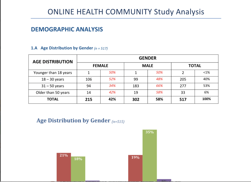
This started with quantitative and qualitative surveys to deepen insights. This took place in the Lekki and Ikeja area of Lagos state. The Survey had 517 participants in Lagos, who participated in the Survey.
This exercise helped to reveal the participants' preferences, requirements age, income level, health habits, source of health information, how they relate to the health information gotten online, how open they are with their doctors/health workers, etc.
Focus Groups
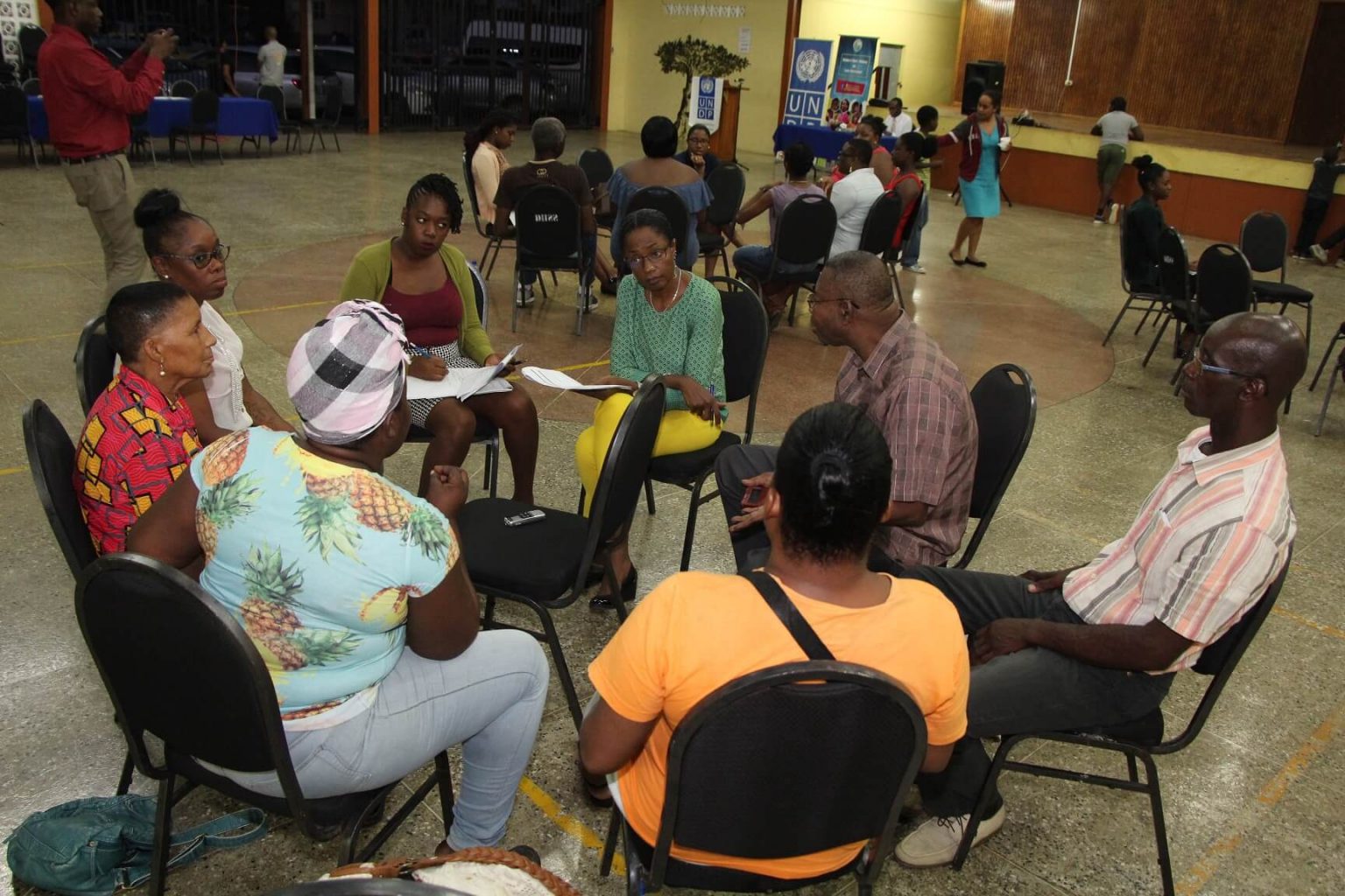
We proceeded to the focus group for two reasons.
- to understand the reason behind the participant's habits.
- to understand what they would look out for in a health website like this.
The participants here were recruited from the questionnaire study.
The discussion was directed by a previously coded discussion guide, comprising 3 main thematic areas, which are :
- General information; sourcing and consumption
- Health information; sourcing and consumption
- Online health information; experiences and consumption.
Personas
This was created to reflect the User's habits, pain points, goals, routine, motivation, etc. Our Target focus is on middle-aged Professionals who have middle to high income (income data is based on the NBS Income value) in Nigeria.
Based on the focus group, we saw the need to set up 4 personas based on if they were sick, healthy, recuperating, or managing a condition. We referred to them throughout the entire product development process.

User persona showing the 4 user types - the sick, the recuperating, managing a health condition & the healthy.
Features Requested by the Users
from the focus group
- Conservative with colours. Nothing flashy
- Use high-resolution images, but no gory pictures
- Short (2 – 3 min) videos on selected topics
- Prominent search box
- Regular and short health tips
- Medical expert/hospital directory
- Triage/symptom box
- Health information archive
- Locally relevant and contextual information
- Easy to understand in English and/or Pidgin English.
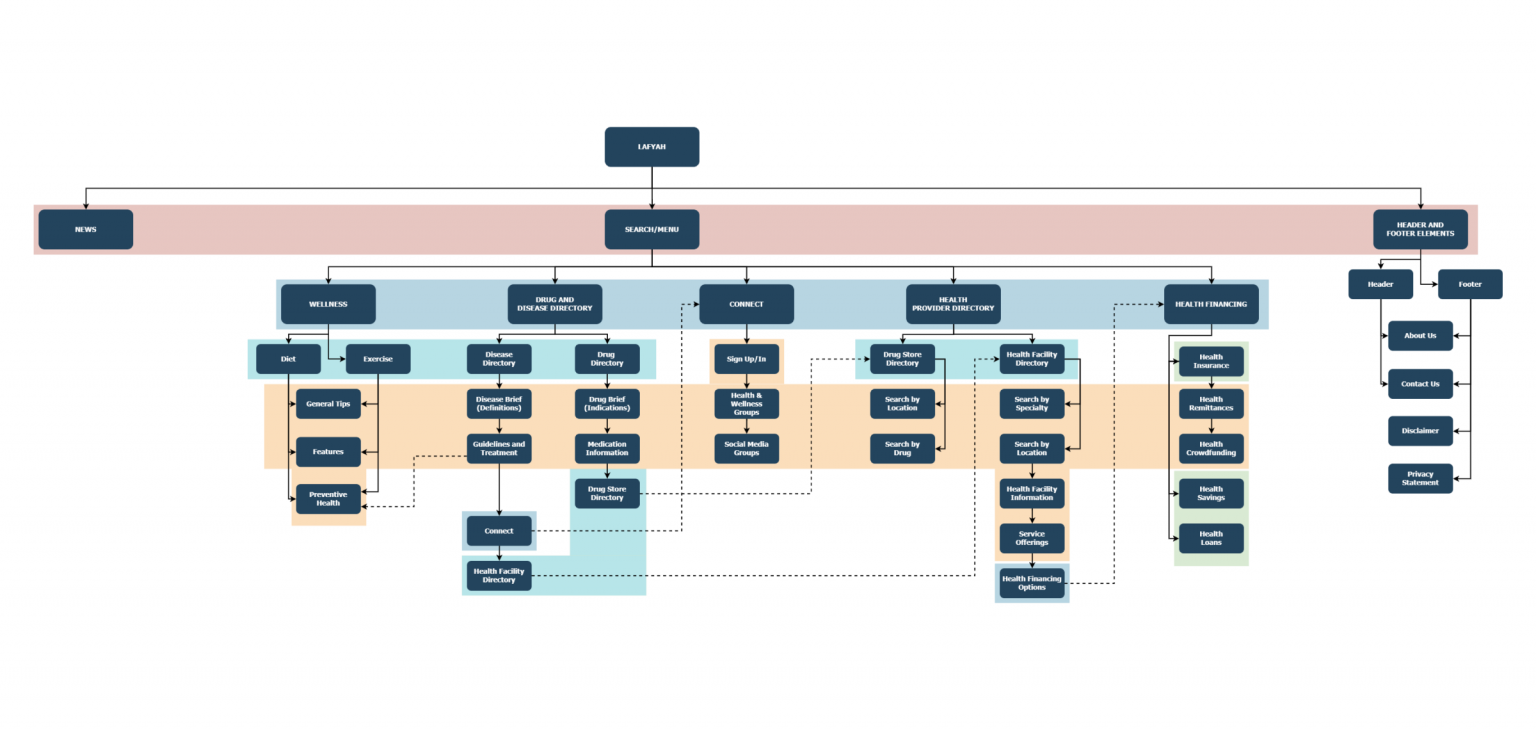
Sitemap
Wireframes
I started designing the wireframes from the features requested by the Users, as this gave a lot of insight into what they would like to see and how the information should be represented.

What does success mean?
Success for this product translates to getting new users to the website and keeping them as converts.
UI Design
Since I already have an idea about the features and how to use design elements to aid with the main aim of this product, I kickstarted interface designing.
I had it at the back of my mind that this product needs to be conservative, no shouting colors but still aesthetically pleasing.
User Testing
After the UI was done, I prototyped it and we tested with the same crop of participants. This was needed to see if the designed solution was usable & met the issues that had been discussed earlier.
The usability test was a moderated one. It was held in the makeshift lab which had cameras broadcasting the sessions to the Stakeholders in the boardroom. Also, the tester's screens were recorded.
Some feedback from the User Testing,
- A prominent search box, multi-word search, and floating ‘Back’ button or link.
- Include a permanent menu navigation bar, and add family-oriented pictures.
- Define data points on-site front page as health-related and include the ‘Current News' section on the Menu.
- Include ‘Current News’ briefs at the end of every search results page
- Merge Privacy and Disclaimer into one link; ‘Legal’. On the ‘Legal’ page, show briefs for ‘Privacy Statement’ and ‘Disclaimer’
- All search results should be listed alphabetically by default and users can filter by other properties.
- Include Hospital Search by locality (use local council development areas, and local government areas as locality indicators) To start with only 57 LGAs/LCDAs of Lagos.
- Hospital search results to be displayed: Locality, Name, Contact Number, Contact Person, Hospital Category (Public or Private), Hospital Type (Primary, Secondary, Tertiary), Services Rendered, Patient Rating, SafeCare Rating, GeoCoordinates, Distance from current location.
- All search results should be initially displayed as briefs (short two to three-line summaries), that should be expandable on touch or click and include a ‘Read More’ link at the end of the brief.
- Disease search results should include a link to hospitals that can treat such diseases. Hospital list per disease will be provided.
- Drug search results should include a link to pharmacies that sell such drugs. Pharmacy list per drug will be provided.
- Include a ‘Sign Up for Newsletters’ field where we collect emails of users who want newsletters.

Feedback from a testing session
Iterations and more iterations
From the testing sessions and the feedback from there, the design was updated. After the testing sessions and the first set of iterations, a couple of internal feedback reports were taken, and after each feedback session, iterations followed. Unfortunately, this became a loop, as iterations continued for a long time.
Conclusion
I discovered that :
- The respondents turned to the internet first for ALL their information needs, including health information. Access to the internet was mainly through their mobile devices.
- Google remains an important gateway for user-generated information searches, and consumers believe they need multiple searches to make an informed decision. Market entry partners may help shorten this user journey to an informed decision.
- An online health information platform should offer expert, disease-specific advice, and must be searchable, affordable, and with locally relevant and contextual information to accommodate the motivations and concerns of potential users.
- For-profit organizations are more willing to offer market entry services and non-profit organizations were more willing to offer information curation and endorsements.
- Managing Stakeholders is a very important part of the job, of a Product Designer. You can only manage but the guys who call the shots, call the shots!
You can view it here
Other Projects

Cardax RedesignWeb Design

Redesigning for valueWeb Design

Streamlining resource definition with co-provisioning for efficient customer workflows.Web Application
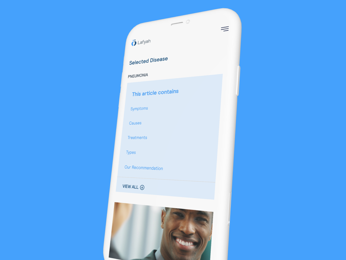
Online Health Community WebsiteWeb Design

Automating an Asset Management company's offeringMobile App Design

Branding for GoBartaBrand Identity

