Redesigning the Lloyds Bank app with offerings for the Gen Z and Millennials crowd
On this team, I worked as a solo Product Designer and brought people in from time to time for external feedback and brainstorming.

My Role
Product Designer
Client
MA Project
Duration
4 weeks
What I did
- POVs & HMWs
- Brainstorming Workshop
- Affinity Mapping,
- Competitive Analysis,
- User persona,
- User interview,
- User journey map,
- Information Architecture,
- Component Library,
- Wireframing,
- User flows,
- UI Design
- Prototyping, and
- Video Walkthrough
Tools
- Figma,
- XD,
- Quicktime player, and
- Figjam
Project Background
As part of my Masters in Interaction Media Practice, I was tasked with redesigning Lloyds Bank for the Millennials and Gen Z crowd.

Image with more information about the features of the mobile app, as supported by research

Video Walkthrough
About Lloyds Bank
Lloyds Bank is a financial services group focused on retail and commercial customers – with millions of customers in the UK and a presence in nearly every community.
Design Goals and Objectives
- Create the best product offerings for the Gen Z and Millennials market (with their needs & wants) at their finger tips, while serving them the best banking experience tailored for them.
- Create a mobile application that is visually appealing to this crowd.

Design thinking

User persona
Competitive Analysis
Lloyds Bank was pitched against top challengers and traditional banks to see strengths & weaknesses. This provided me with insights and features that Lloyds Bank might be missing out on.

Competitive Analysis
To understand pain points, I did a User interview, & User journey map
I interviewed 3 people all aged within the User demographic, 25 - 35 years, based in the UK. They all have at least one current bank account.

User interview insights

Affinity mapping

User journey mapping
Key insights from the user journey map
- Use clear and precise messaging about features.
- Gamify savings and add a Leaderboard.
- Accessible customer support and chatbot.
- Millennials and Gen Z-focused product offerings.
- Aesthetically pleasing interface.
- Clear next steps for every process.
- Rewards.

POVs and HMWs

Brainstorming Workshop
Gathering insights from research
From research, I was able to make decisions concerning features, product offerings, and general outlook of the mobile app.

Feature list

Features that made it to the mobile app
User flow & Wireframes
Using insights from the Feature list, I designed user flow and wireframes.

User flow

Wireframes
Component Library and Designing the UI
Then, I proceeded to the UI design.

UI Screens


Conclusion
My key takeaway:
- Desk research especially Play Store and Apple Store are great places for user insights and frustrations.
Other Projects

Cardax RedesignWeb Design

Redesigning for valueWeb Design


Streamlining resource definition with co-provisioning for efficient customer workflows.Web Application
Online Health Community WebsiteWeb Design

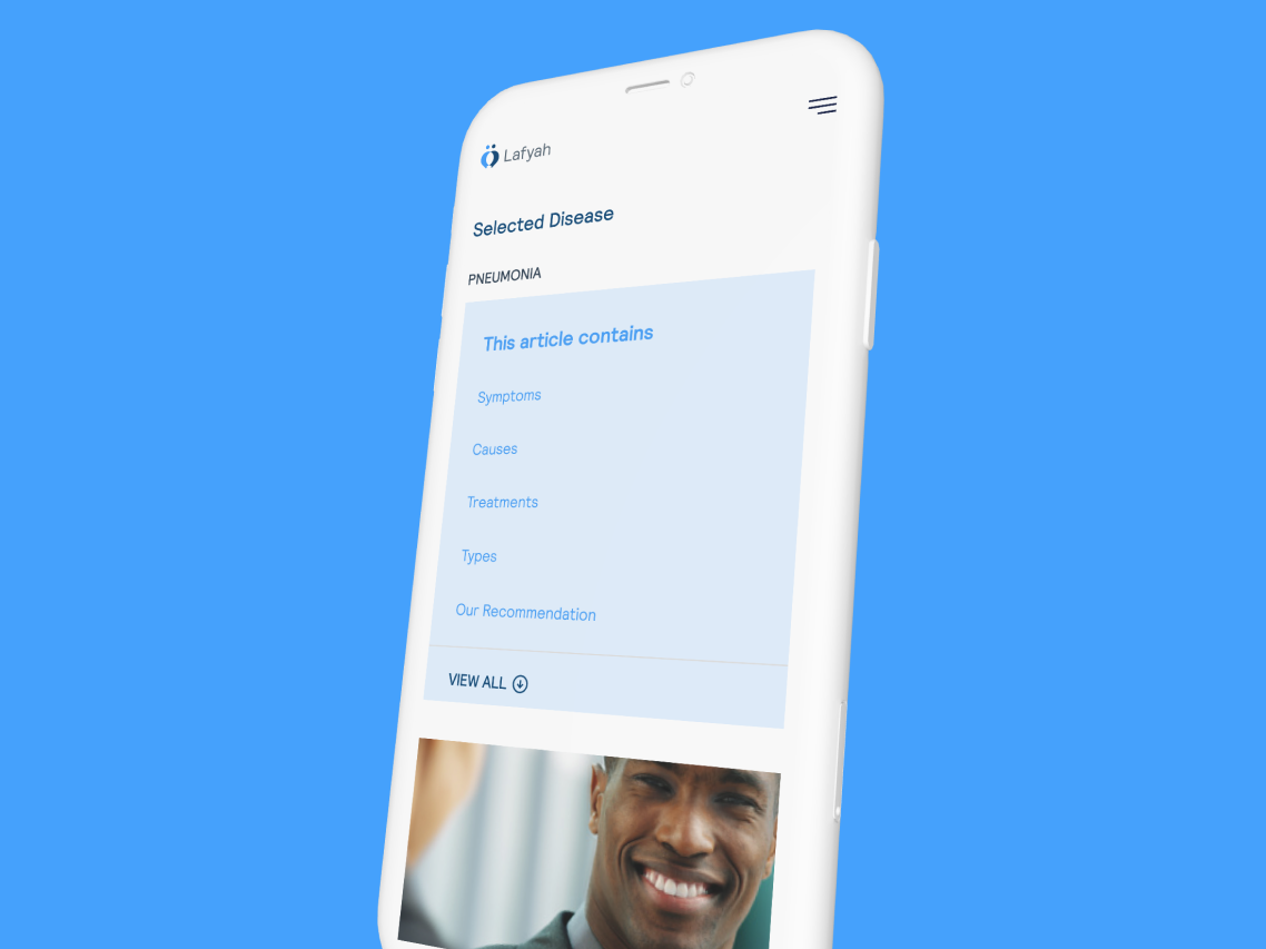
Automating an Asset Management company's offeringMobile App Design

Branding for GoBartaBrand Identity
