Branding GoBarta
GoBarta is a barter exchange platform for everyone. As long as you have an item you currently have no use for, you can trade it by barter to get something of value to you. This would help to reduce the waste of items and it would help people get certain objects for something within their disposal that they no longer need.

My Role
Brand Designer
Duration
2 weeks
Tools
Adobe Illustrator
Brand Discovery
To begin this phase, I started out by giving the Client a Logo Questionnaire to fill, in so as to collect very important details and document them (this makes it easy for me to refer back here during my ideation stage). After the Questionnaire gets filled by the Client, I ask further probing questions on items like the demographics and psychographics of target users if there are any.
Brand goal
It is to create a brand recognition that is easily memorable by the target users. “Research has shown that brand recognition is often more valauable than the company itself” – IDF.
I approached it from the side of creating an identity system that is simple and memorable for a new brand and can be used across boards from small to large print, websites, and still retain it’s message and intent.
Moodboard
I created a Moodboard to enhance Creative Direction and to help me picture what other Logos with similar ‘intent’ look like.
Ideation
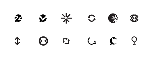
Bearing in mind that I wanted the logo to have/reflect the core message which is transfer, I set out to start trying ideas that I had at this point. I started off this stage with divergent thinking where I just kept generating ideas because the quantity of the ideas was more important to me than the quality.
After a while, I stopped with divergent thinking and focused on convergent thinking where I had to start closing off with ideas and settling with the quality ones.
I went through this entire stage in a couple of days until I struck gold.
PS – My motto throughout this stage is No Bad Ideas.
Colors
I chose green because this barter system works to better our environment and our health. Instead of items wasting away or being burnt or used to litter our environment, they can be ‘bartered’ to somebody else who has a need and values it.
Also, the green color spells recycling and making our environment better. The dark color complements the green and tones down its vibrancy.

Presenting the logo
After arriving at and fine-tuning this idea, I created a presentation and shared it with the Client. He loved it and wants to move forward with the idea.


Conclusion
Our environment is our responsibility and doing what we can to sustain it is important. Also, why not barter it, instead of wasting it away?
Other Projects

Cardax RedesignWeb Design


Redesigning for valueWeb Design


Streamlining resource definition with co-provisioning for efficient customer workflows.Web Application
Online Health Community WebsiteWeb Design

Automating an Asset Management company's offeringMobile App Design

Branding for GoBartaBrand Identity
