Optimizing a Designer's website for better conversion
I increased the conversion rate of this website by 10.56% and reduced the bounce rate by 2.8%

Client
Myself
My Role
UX Designer
Duration
6 weeks
What I did
- Heatmaps & Recordings
- Workshop facilitation
- Wireframing
- A/B Testing
Tools
- Hotjar,
- Mouseflow,
- Google Analytics, &
- WordPress
Introduction
After redesigning my website’s UI and launching it on Jul 18th, 2022, I monitored the analytics continuously and I noticed a pattern. Conversion rates were not so high, and bounce rates were high. Then, I got a mail that probed me to think the current version wasn’t serving users as much as I want it to.

This email, of course, made me probe to better understand how users scan my website, so I can put the right information where users would look for them.
PS - There is a testimonial section on my website and it’s close to the footer on the homepage.

Success metrics
Success for this exercise would curtail in
- higher Conversion rate (Conversion rate optimization), and
- reduced bounce rate.
What I did
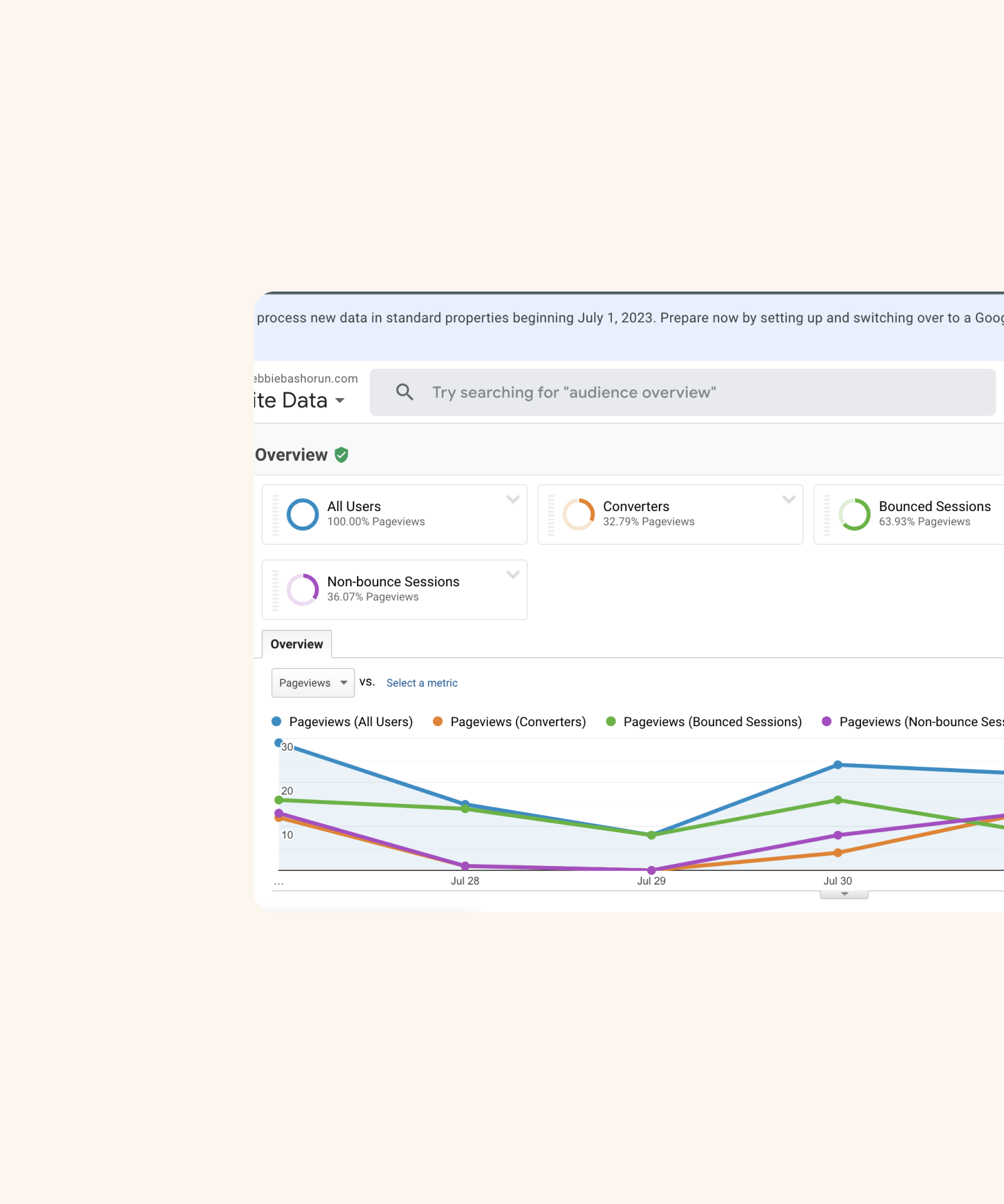
I then installed hotjar to understand better my user's behavior as regards my website. I installed hotjar on Aug 4th, 2022, and let it run its course for 7 days. I pinned the homepage, project, and 2 case study pages so I could study their heatmaps.
PS - These were the same pages my conversion funnels used.
The heatmap recordings showed me pages that users were checking out and some were outside of the four pages I initially added, so I added the extra pages.

Results
- The load time for the home page is quite high at 19.44s & the about page at 5.12s , and this makes the loading slow.
- The “Get in touch” text on the footer on every page, has quite a no of clicks,
- By the time it got to the Testimonials part, about 50% of the website users scrolled there.
- The navigation menu was well interacted with.
- All the case study pages had at least a 75% scroll rate.
- The project page starts with 100% and dips to 97.5% till the end.
- On the home page, the scroll rate dips to 50%, as you go lower.
- The about page starts with a 100% scroll rate and dips to 50%.
Hypothesis
Based on the above results, I picked out solutions to the problems.

Wireframes
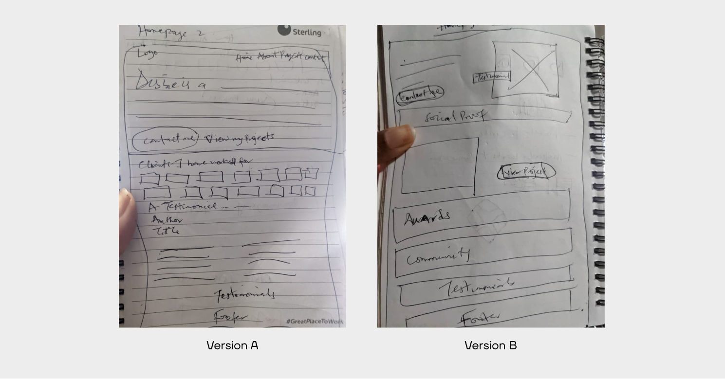
I wireframed the solutions in the hypothesis to the Homepage (Version A) and facilitated a crazy 8s session for Version B because I was stuck on ideating.
Brainstorm - Crazy 8s
I went with Crazy 8s because I had an idea in my head but I had to check if there were other, better, or more innovative ideas/solutions. Seeing as it’s a brainstorming session, I got a few Design friends together to brainstorm along with me, and I facilitated it.
Crazy 8s ongoing

Result

Wireframes
I converted the crazy 8s session's result to a wireframe and used it as the version B for my A/B testing.
Homepage wireframes
About page wireframes

Testing - A/B Test
I saw two versions of each page from wireframing my idea (Version A) and the crazy 8s session result (Version B). I did A/B testing to see the better-performing option. I made the changes to the UI on WordPress, labeled it version A, and let Mouseflow % Google Analytics do their thing, while I collected the readings. When it was done, I did the same thing for version B.
Even though I initially wanted to test each version for 2 days, but then, I noticed 2 days was too small to collect the data I needed to inform my decision. This increased to 1 week, for each version.
A/B Test Result

Version A wins
Version A converted over 2 times of Version B.
Seeing that version A performed better, based on the pre-conceived metrics, I moved forward with version A. This marked the end of this experimentation.
Others
While I was focused on the two goals - increasing conversion rate and decreasing bounce rate, other metrics such as average pages per session, returning users, rage clicks, average friction score, etc were doing quite well with the redesign.
Also, I noticed an increase in clicks on version A, with over 51% increase in clicks of the “Contact me” and “View Projects” buttons.

Conclusion
This was not very straightforward and I am happy I went through this optimization exercise.
My key takeaways are:
- I noticed Google Analytics & Hotjar calculated metrics like bounce rate very differently. So I had to use Hotjar for heatmaps & recordings only, and use Analytics for bounce & conversion rate.
- I learned about Mouseflow and it helped me see what the problems are, better than any tool I had used earlier.
- Divergent thinking after understanding the problem is very key. This is because as Designers ideas are probably always swirling in our heads already but we need to step out and brainstorm.
- I saw the importance of collecting data over time ranging from 1 - 4 weeks as opposed to a couple of days which was what I had in mind for the A/B testing initially.
Other Projects

Cardax RedesignWeb Design


Redesigning for valueWeb Design


Streamlining resource definition with co-provisioning for efficient customer workflows.Web Application
Online Health Community WebsiteWeb Design

Automating an Asset Management company's offeringMobile App Design

Branding for GoBartaBrand Identity
