Redesigning a DEX website UI
On this team, I worked as the solo Freelance Designer, along with the Stakeholder, a Front-End Developer, and a Copywriter.

My Role
UI Designer
Client
Cardax
Duration
3 weeks
What I did
- Information Architecture,
- Component Library,
- UI Design, and
- Prototyping
Tools
- Figma, and
- Figjam
Project Brief
When the best DEX on Cardano, wanted to communicate its rebrand to its futuristic-focused user, I was contacted to do the job. The first touchpoint user/prospective users of the Cardax DEX interact with is the website – Cardax.io. To redesign Cardax’s website, I thought about how best to communicate to these Cardano lovers, how great a DEX, Cardax is and why Cardax deserves the no 1 spot.
The Problems with the Old Website
This solution is both a redesign of all the previously existing features and the addition of a new one.
- The current User interface was not to the standard of the Brand’s persona.
- The absence of the Academy where Users can learn about the DEX, Cardano, blockchain, and the Decentralized world generally.
Research Report
After reading the report from the User Research done, I understood why this redesign was needed and how the website caters to it’s users (by converting them). I understand that the research report helped with decision-making, as regards choosing a creative direction that resonates with users.


Cardax Business Goals
- To have the biggest decentralized exchange platform within Cardano with the biggest volume, within the next 2 years.
- To be a website that users love and where they go to for everything cardano.
Sitemap
Knowing how important the Sitemap is to help users better navigate the website, hence, aiding usability. I proceeded to create one for this website.
Then, I arranged the different features of the new Website i.e I designed the Sitemap, which I shared with the team to get feedback. The feedback I got helped me iterate it until we all agreed on it, then I proceeded to the next step.

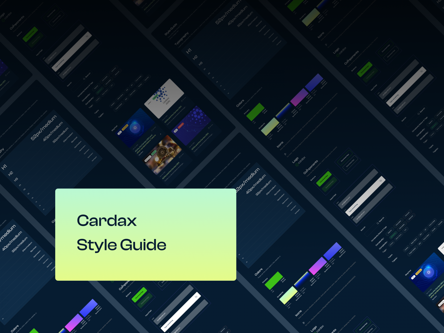
On Creative Direction – Component Library

Visual Design
The solution I came up with, is a modern, organized, different, and user-friendly site that is responsive and futuristic. Every design decision was made with this, in mind.
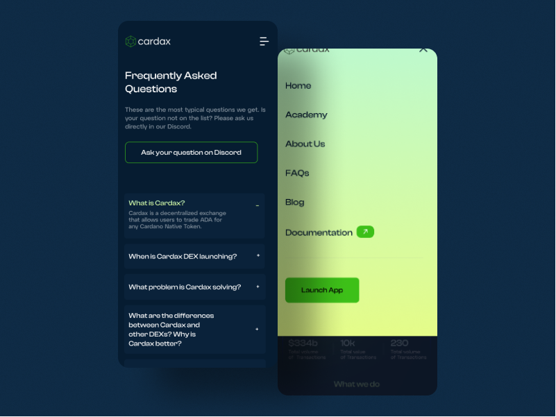
At the top of the list, I made sure it was responsive, to make it easy for users whose first point of call, is to view the website on mobile.


Before Redesign
After Redesign

View the Prototype here
I made a prototype of the UI.

Some Users Feedback
After reading the report from the User Research done, I understood why this redesign was needed and how the website caters to it’s users (by converting them). I understand that the research report helped with decision-making, as regards choosing a creative direction that resonates with users.

Impacts
Coming soon!
Conclusion
This project was pretty interesting and very informative for me, as a new Web3 Designer, at the time I started this project.
My key takeaways are:
- Figma as a tool for Designing has done more for me in terms of collaborating with individuals from all over the world, especially on this project.
- Web3 is the future and it’s right now.
Other Projects

Cardax RedesignWeb Design

Redesigning for valueWeb Design

Streamlining resource definition with co-provisioning for efficient customer workflows.Web Application

Online Health Community WebsiteWeb Design

Automating an Asset Management company's offeringMobile App Design

Branding for GoBartaBrand Identity


